Diving Into YouTube’s Android Facelift: A Clash of Style and Function
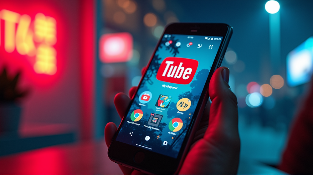
Embrace the unexpected with YouTube’s sweeping redesign, now reaching Android screens everywhere! YouTube’s latest transformation rekindles the debate of aesthetics versus functionality. Witness the fresh elegance of pill-style groups housing familiar icons and the subtle power of refined gestures as these innovations usher in a new era of video navigation efficiency.
Transforming the Player Experience
Let’s journey through the redesigned video player, where essential actions such as like, dislike, share, and download now reside in rounded, contrasting containers. This evolution ensures effortless interaction amidst the thrill of consuming content. The full-screen interface, reimagined with larger touch targets, echoes simplicity, transforming scattered buttons into an intuitive harmony, promising a seamless experience.
The Science Behind the Staggered Release
The rollout of this bold new design isn’t chaotic; instead, it’s a meticulously planned leap towards modern uniformity. Google initiates the update as a server-side stratagem, ensuring users slowly acquaint themselves with either complete or partial updates. This A/B testing embodies a careful orchestration, leaving some to taste change while others anticipate new horizons.
Designing for Accessibility and Coherence
Beyond the allure of sleek designs lies the intention of inclusivity. The revamped icons and button configurations are no mere cosmetic alterations—they are crafted for accessibility. Google’s dedication to Material Design principles means alignment with larger targets, minimizing frustration and enriching the user experience, particularly for those with motor challenges.
Navigating User Sentiment: Embrace or Reject?
Change wields a double-edged sword. Is it perplexing, or does it archive frustration as a relic of the past? Conversations brew as community threads and social media reflect the tumult of feelings. Amidst critique lies assurance; accessibility advocates tout the advantages, marking tangible wins in digital inclusiveness for YouTube’s vast user base, surpassing 2 billion monthly visitors.
In the Wake of Visual Overhaul
Look closer, and find more than merely reshaped icons. Conversations blossom through deeper comment threading, and visuals become increasingly intuitive, offering easier navigation through layered responses. Shorts catapult into prominence courtesy of redefined icons and a swipe-heavy ambiance, sculpting a cornerstone of YouTube’s future.
Anticipating Future Shifts
Await no epilogue; the redesign tap dance begins—a refined routine rolling across your screen without invitation. Recognize YouTube’s strategic patience in these tiny adjustments, perfecting tweaks based on user feedback. Generosity lives in Google’s promise of uniform, visually evocative experiences across platforms.
In this age, where the familiar becomes foreign and function is dressed in daring new forms, there remains a certainty: YouTube is evolving, whether in harmony with or in contrast to your preferences. Navigate, reflect, and discover what this transformative journey brings next.
By Gregory Zuckerman, with deep investigative insights and a keen eye for the intricacies of global markets and technology innovations.