Google Maps Redefines Navigational Experience with Sleek New Design
Google Maps, a beloved travel companion for millions, is undergoing a compelling evolution. As part of its ambition to offer users a more intuitive interface, Google has thoroughly revamped its Android app’s look and feel, introducing sleek slide-up information cards. Let’s delve into this exciting overhaul that promises to change our navigational experiences for the better.
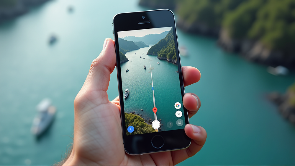
Embracing the Sheet-Based Interface
Starting last year, users began noticing a subtle shift in the way Google Maps displayed information. Traditional full-screen menus gave way to sheet-style interfaces — information cards nestled at the bottom of the screen. Unlike the cumbersome full-screen counterparts, these sheets can expand or retract with ease, ensuring more of the map remains visible and users stay focused on their paths. According to Android Police, this seamless transition from full-screen dominance to dynamic layers enhances the overall user experience and allows effortless interaction with the app’s diverse offerings.
A Refined Travel Mode Picker
The travel mode picker, a crucial feature, also got its share of attention. Once buried within cumbersome menus, it now enjoys a position of prominence at the bottom of the screen. This repositioning means users can swiftly choose between driving, walking, or other transit modes with just a thumb’s nudge—striking a harmonious balance between accessibility and functionality.
A Journey from Concept to Reality
The road to this transformation wasn’t overnight. Initial glimpses of this redesign emerged during beta testing sessions as early as last February. After intermittent appearances and subsequent refinements, Google rolled out the new concept more broadly by mid-year, culminating in what we now see across core sections of the app.
Transforming User Outlook
Though seemingly minor, these design shifts significantly enhance user orientation by reducing screen clutter and aligning functionality with user habits. Previously, full-screen displays could overwhelm users, particularly those not intimately familiar with the app’s nuances. The new design philosophy addresses these challenges head-on, simplifying the navigational experience and empowering users to make the most of their journeys.
The Big Picture: User-Centric Design
Google’s commitment to user-centric design is evident in these changes. By opting for round-cornered slides over rectangular overlays, the app consistently offers a visual delight, pulling users deeper into the experience with less effort. As noted, the ability to retain one’s focus on the map while engaging with relevant information is a significant win for users.
Navigating with Google Maps has never been more efficient or enjoyable, thanks to these thoughtful enhancements based on real-world feedback and evolving needs. As users become more acquainted with these features, Google Maps continues to establish itself as a cornerstone for navigating the world seamlessly and stylishly.